How to Add Inexpensive Architectural Details to Your Home {One Room Challenge Week 2}
I’ve been dying to add a few architectural details to my boxy home ever since my “This is Us” living and dining room makeover. A bit of molding would make the perfect crown for the edgy fuchsia damask wallpaper I installed there. Additionally, beefing up the encasement around the doors of my small entryway would add the illusion of height. So why haven’t I done it yet? In a word: fear.
However, the One Room Challenge is the perfect chance to tap into my inner rock star - even if I sometimes don’t believe she exists - and make more daring choices! Since my home office/guest room is small, now is a great time to step out of my comfort zone. Am I nervous about adding architectural features to my space using my own skills? Heck yeah! But nothing beats a failure but a try. So “a try” is what I shall give it. Welcome to Week 2 of the One Room Challenge!
2019 ORC Schedule: Week 1: Inspiration // Week 2: Architectural Interest // Week 3 IKEA PAX Hack - // Week 4 - Mystery Hack // Week 5 - The 5th Wall // Week 6: Reveal Time
Affiliate links may be included in this post. This means that should you purchase a linked product, I may receive a small commission, but at no additional cost to you. To read my full disclosure click here.
“Am I nervous about adding architectural features to my space using my own skills? Heck yeah! But nothing beats a failure but a try. So “a try” is what I shall give it.”
What are Architectural Details?
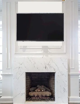
Architectural details are the small (often overlooked) permanent finishes of a space that have the power to characterize and define the entire room. Sometimes they are used to hide ugly imperfections. Other times, inexpensive architectural features do nothing more than breathe dimension and charm into an otherwise dull space.
While such details may not necesarily add monetary value to a home, they make a lasting and persuasive impression. Ironically, the persuasive kiss of a little wall moulding could inadvertently add up to higher dollars at resale. See what I did there? If adding more character and charm to your home is something you’ve been considering, read on.
3 Easy Ways to Add Character to Your Home Through Architecture
The 3 main ways to add architectural interest to your home are:
Crown molding
Wall panels (or wall moulding)
Doorway headers
Both crown molding and wall panels are very affordable ways to add interest to walls and ceilings. A simple piece of wood or MDF measuring 4-6" high, can also be placed over doorways to draw the eyes upward, and beef up an entryway.
Old Walls Need Love Too
Don’t let the photos fool you. The 2 walls featured above are in really bad condition. Hiring a professional that specializes in plaster walls is not in the budget. So I'll be using a mixture of crown and wall moulding to add small but impactful interest to my office/guest room. Additionally, applying Sherwin Williams' Tricorn black in a matte finish will hide some of the wall’s imperfections.
Installing crown moulding is a rather intense process that deserves its own space. So I’ll address that another time. In this post, I will only address how to install wall moulding. Below is the process I’ve used.
Needed Items
Caulk
Thin wood, MDF, or foam strips for wall panels
Wood glue
Miter saw (here’s the one I use) or a miter box with handheld saw (which I also use)
Nail gun (if installing manually, use finishing nails and a nail set to countersink them into the trim)
A little bit of math
How to Install Wall Moulding (Wall Panels)
1. Measure the length and width of your space and determine how large you want your wall panels. Here’s how:
After measuring the span of each wall, I decided I wanted the boxes to set 8 inches from the ceiling, and 10 inches from the floor. This is the perimeter, the area around the panels.
Next, I determined how far I wanted the wall panels to set from one another. For me that was 4”.
I wanted fairly large boxes with a simple, modern aesthetic. Thirty-five and a half inches wide for each box was the sweet spot. Once I subtracted 8” from the top, and 10” from the bottom, that left me a box height of 75” +/-. Perfect for my 8 foot ceilings.
Five rectangle boxes measuring 35½” x 75” with no chair rail in the center is what I needed.
Using a pencil, I marked the exact placement of boxes directly onto the walls.
4. Using a miter box, I cut a 45 degree angle at the end if each moulding strip to create a tight joint.
5. Either method of assembling the panel boxes before adhering them to the wall, or piece by piece during installation will work. I tried it both ways.
6. When applying the moulding strips, be sure to apply a bead of wood glue or another adhesive along the backside before nailing. NOTE: The glue and nails work together to keep the moulding in place.
7. Caulk & paint
Et Voila, you are done!
“Work-in-progress” photos are rarely cool looking. But I did my best to stage these in a way that was most appealing. I encourage you to scroll up and down to view the before and afters of this corner. The difference is shocking to me to say the least.
I was both surprised and relieved by how easy it was to add this feature to my space. Even The Husband gave me his signature, nasal nose “whaaaow” (a sign of shock and approval). Installing the crown molding will be a slight step up, but I'm ready for the challenge.
If you’re wondering how I’m doing on my budget, here's where I stand:
-Furnishings $200
-Building Mat'ls $125 (currently $65)
-Accessories $ 130
-Lighting $45 (currently $40)
Total: $500 (+20% contingency) // Current Standing: $435 ($65 under budget) Woo hoo!
To keep up with details not captured in my blog posts, follow me on Instagram to view my highlights and stories. But for now, please let me know your thoughts on the One Room Challenge, the inspiration, or just anything in general. I love hearing from you.
*NOTE: To view the other participants in this challenge hop on over to the ORC website.


