Adding a Touch of Urban Chic to a Small 19th Century Home
How do you restore character to an old home in a way that is modern and chic? That’s the question that I’ve been asking myself since I started this design journey with my client.
She’s a young, hip professional. Yet the home is 115 year old. How on earth was I going to be able to blend the two successfully? The answer was simple, I had to take a few risks.
It’s week 6 of the One Room Challenge. My head hurts, my body aches from all the heavy lifting and because of all that, THIS ladies and gentlemen, is about to be the shortest post you’ve ever read on this blog. If you’re just joining me, you can find all the details on the space I’m transforming below:
Week 1: Small Living Room Makeover: The Challenges // Week 2: Mood Board and Floor Plan // Week 3: Lighting Design Plan // Week 4: Wall moldings // Week 5: DiY Fireplace plans // Week 6: Ceiling Decoration // Week 7: Awkward Alcove Dilemma // Week 8: Small Living Room Makeover REVEAL
Refusing to Ignore the Obvious
I’ll admit, when I first laid eyes on this space I was completely stumped as to what to do. It was quirky and mysterious like most of the small spaces I work with. But NEVER had I ever worked on a house with bones this old before.
My first call was to a local architect who revealed a fascinating gem. I noticed an odd channel running along the ceiling in a unique but very purposeful manner. But it didn’t strike me as something that would have been added recently. See the very unpretty but interesting photo below.
What the Local Architect Revealed
I found a special interest group here in Chicago called Preservation Chicago, whose mission is to “protect and revitalize Chicago’s irreplaceable architecture, neighborhoods and urban green spaces.” I spoke with Architect and Executive Director Ward Miller who allowed me to share photos I had taken of the ceiling.
To my surprise he revealed that the nearly 12ft high ceiling was originally domed! Say whaaat?? He added that it’s possible that it was so damaged that the best solution was to lower it a bet to the channel.
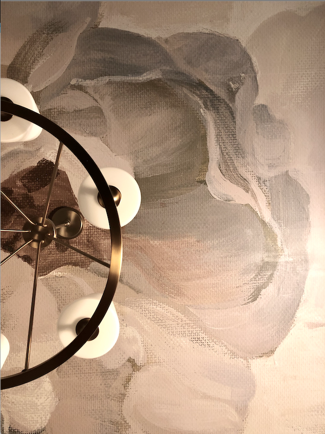
Armed with that fascinating information I devised a plan to create a womanly, urban chic version of what I imagined it might have looked like back in 1906. Check out what we did below!
Yep, you guessed it, I added a life-sized mural! Interestingly, portions of the ceiling actually moved upward whenever we pressed the wallpaper into place. My guess is that there are at least 1 to 2 feet of dead space above.
Perhaps one day my client will restore it. But for now, she can enjoy a very couture and chic view above.


