One Room Challenge: A Stunning Guest Room-Office is Delivered
What began as a mere guest room office makeover quickly metamorphosed into an elegant and edgy, rocked out hotel suite. Seriously y'all, I think my master bedroom might be jealous.
Although weeks 4 and 5 resulted in the most stressful weeks of any of my past involvements in the One Room Challenge, I'm happy to say The Husband and I made it in one piece, and that it's FINALLY reveal week! Welcome to the 6th and final week.
2019 ORC Schedule: Week 1: Inspiration // Week 2: Architectural Interest // Week 3 IKEA PAX Hack - // Week 4 - Mystery Hack // Week 5 - The 5th Wall // Week 6: Reveal Time
Affiliate links may be included in this post. This means that should you purchase a linked product, I may receive a small commission, but at no additional cost to you. To read my full disclosure click here.
Original Guest Room/Office Makeover Plans Fall Apart
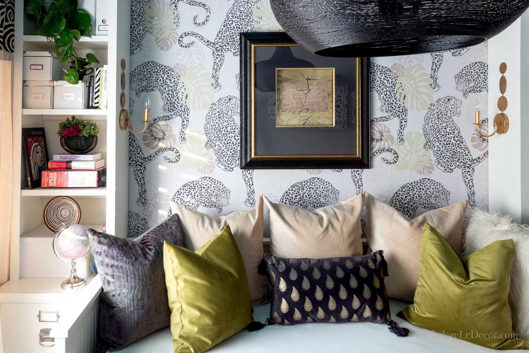
Anxiety levels kicked into high gear last week when I discovered that the wallpaper I had selected and ordered was defective. With just 8 days before reveal day, I had NOTHING but badly wrinkled, shrunken paper on my walls. Fortunately for me, the highly respected Milton & King stepped up to assist with a solution that was better than my original plan. The edgy LEOPARD WALLPAPER in crisp creamy tones complimented my color scheme beautifully. The neutral hues also allowed me to play up the jewel tone textiles I had selected.
A huge THANK YOU to all the folks at Milton & King, as well as to Linda Weinstein, the mastermind behind this awesome challenge!
A Better Plan Realized for This Challenging Small Space
During past ORC events, I deliberately avoided this space because I knew it would be a challenge to transform. Uneven walls, ceilings and floors, and a limited wall outlets - only 2 to be exact - in the stud-less walls of this 9ft x 14ft room, are what I had to work with. Seriously y’all, these walls have more curves than Kim Kardashian! Installing the crown molding (my first attempt) was a trip
“The walls in my 9x14 guest room-office have more curves than Kim Kardashian...I KNEW it would be a challenge to transform! ”
I live in a small home where nearly every room needs to operate like a workhorse. This space was no exception. We use it for a LOT of different things like:
A comfortable place to work from home
A place to house a small mainframe and work computer
A place to store household documents
An occasional exercise room (think pilates)
My closet (one of only 3 in the home) is located in this space, so it becomes sort of a dressing room
A weekday crash spot to read and watch TV due to its close proximity to the bedroom
And oh, did I mention this is where overnight guests sleep?
With a list like that, it’s no wonder It took me so long to figure out how to bring it all together.
“I am tired and my body aches...It was such hard work. But by the grace of God, we somehow got it done. And it is in this very space, now finished, that I write this post.”
Hard Work Gets Rewarded
I pushed myself harder in this space than ever before. I am tired and my body aches from all the carpentry work, heavy lifting and constant hauling of things up and down 2 flights of stairs during these past 6 weeks. It was such hard work. But by the grace of God, we somehow got it done. And it is in this very space (now completely made over) that I am writing this post. I keep looking over my shoulder to see if this makeover is real. It is.
As you view the photos, you’ll notice that I’ve styled the space a few different ways to show the versatility of the space. And so now I am very proud to present this makeover to you. Enjoy.
Creating Zones is #1 My Small Space Rule
Zoning out even the tiniest of spaces works best for me. Paint is the easiest way to create an uncluttered, visual separation. I used two different wall colors, and a Cabana Blue by Behr, on the ceiling to bridge everything together.
The first peek at the rich dark walls gives absolutely NO indication as to what else lies in this space. The decadent and dramatic Tricorn Black by Sherwin Williams draws you right inside. Everything on the black wall is appropriately referred to as the “office”.
But note: this is a fully operational home office - not just a cool photo shoot. Every file, box and pouch you see in this space gets used and contains information to help The Husband and I handle our various affairs.
The black , metal and green glass desk and matching bookcase were purchased at Dania Furniture. They were pretty pricey, but it was money well spent. The sturdy black and silver trimmed office accessories are ones that we’ve had for years. They’re from IKEA.
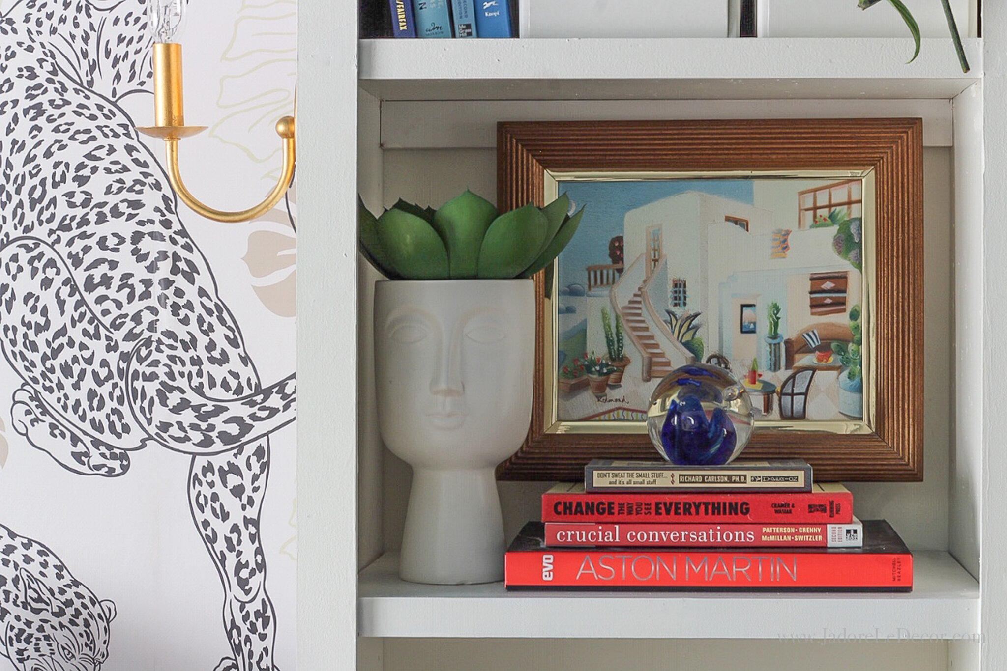
All work and no play makes Jack a dull boy right? So imagine my excitement when a bit of aggressive purging helped me to carve out a small space for a little art gallery. The latest addition of the Hayley Mitchel print is my new favorite.
A step back outside of the office and slight turn to the left reveals a hidden surprise! It’s like two personalities rolled into one room! The daring blue/green ceiling ties the two zones together.
And yes, I own more pillows than HomeGoods! This day bed is unusually deep. While I usually try to be more sparse with my cushions, I knew this space could handle a bit more.
About That Wallpaper
This is hands down THE most daring wallpaper I’ve ever used! The print is large-scale, vivid and very much attention grabbing. I can’t wait to have my girlfriends over for chick flick night.
Space for Other Perks
As if all of this weren’t already enough, I managed to carve out space for a library, record archives, and coffee bar. Yes! I was even able to get a coffee bar inside! There is a vintage mirror that I simply leaned against the wall and a warm robe for my next guest.
How I Did on My Budget
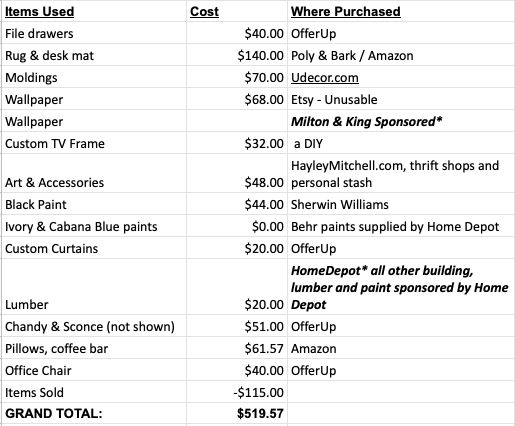
So I bet you’re wondering, where I spent the $500 budget and how I faired. Long story short, I went over by roughly $20. Not too shabby huh? Below is how it all breaks down.
But I have to keep it real with you. Budget shopping for a room makeover is an exhausting process. One that I am not eager to repeat. Ha! But I’m happy with the results.
A HUGE thank you again to my sponsors, Home Depot Matteson and Milton and King for helping me make the happen!
*NOTE: To view the other participants in this challenge hop on over to the ORC website.
Editing the Space (UPDATE)
Well this is awkward… No sooner than the One Room Challenge ended did I begin making changes to the space above. Why? Simply put, I just wasn’t feeling the guest room portion of this makeover.
So I created a separate post outlining the three changes I made to this newly remodeled guest room/office and why. Feel free to click the link or the image below to view the updated space. In the meantime, here’s a sneak peak of what it looks like now after stretching my budget a mere $50 more.


