7 Important Lessons I Relearned From the One Room Challenge
We are only 10 days past the One Room Challenge (at the time of the writing this post) and no sooner than it ended I began making changes to my guest room/office reveal. Why? Simply put, I just wasn’t feelin’ it.
Weeks 4 and 5 resulted in the most stressful weeks of any of my past involvements in the One Room Challenge, when I discovered that the featured wallpaper I chose was a defective product. I had just 8 days to figure something out. Although I chose a stunning but completely different replacement wallpaper, I neglected to modify my design accordingly. The result, in my opinion was a room that was totally “unhinged” from itself.
2019 ORC Schedule: Week 1: Inspiration // Week 2: Architectural Interest // Week 3 IKEA PAX Hack - // Week 4 - Mystery Hack // Week 5 - The 5th Wall // Week 6: Reveal Time
Affiliate links may be included in this post. This means that should you purchase a linked product, I may receive a small commission, but at no additional cost to you. To read my full disclosure click here.
3 Makeover Design Mistakes I Made & What I Learned
In my very first blog post more than 3 years ago I promised that I would use this platform to share both my decorating “hits and misses” with you. Today I’m making good on that.
To be clear though, the “office” portion of this space suits my tastes perfectly. I love the moody black on black tones. It was the “guest room” side of the space where all the problems started. So here are some important lessons I learned from this seasons One Room Challenge, and how I used these lessons to fix that portion of this room. As a reminder here is what the space it looked like before.
1. Get Rid of “Meaningless” Things
One thing I quickly realized, even as I was photographing my reveal space, was that I had way too many pillows on that daybed. Over-styling is truly my design weakness.
I counted 10 pillows in the image below. That number is down from the 14 that were there before. Yikes! The funny part is that they really didn’t add much to the space. Whenever that happens, its a sure sign to remove them - which is what I did. So the first thing I did was reduce that number to eight - a good number for a deep daybed.
2. Introduce Color Thoughtfully
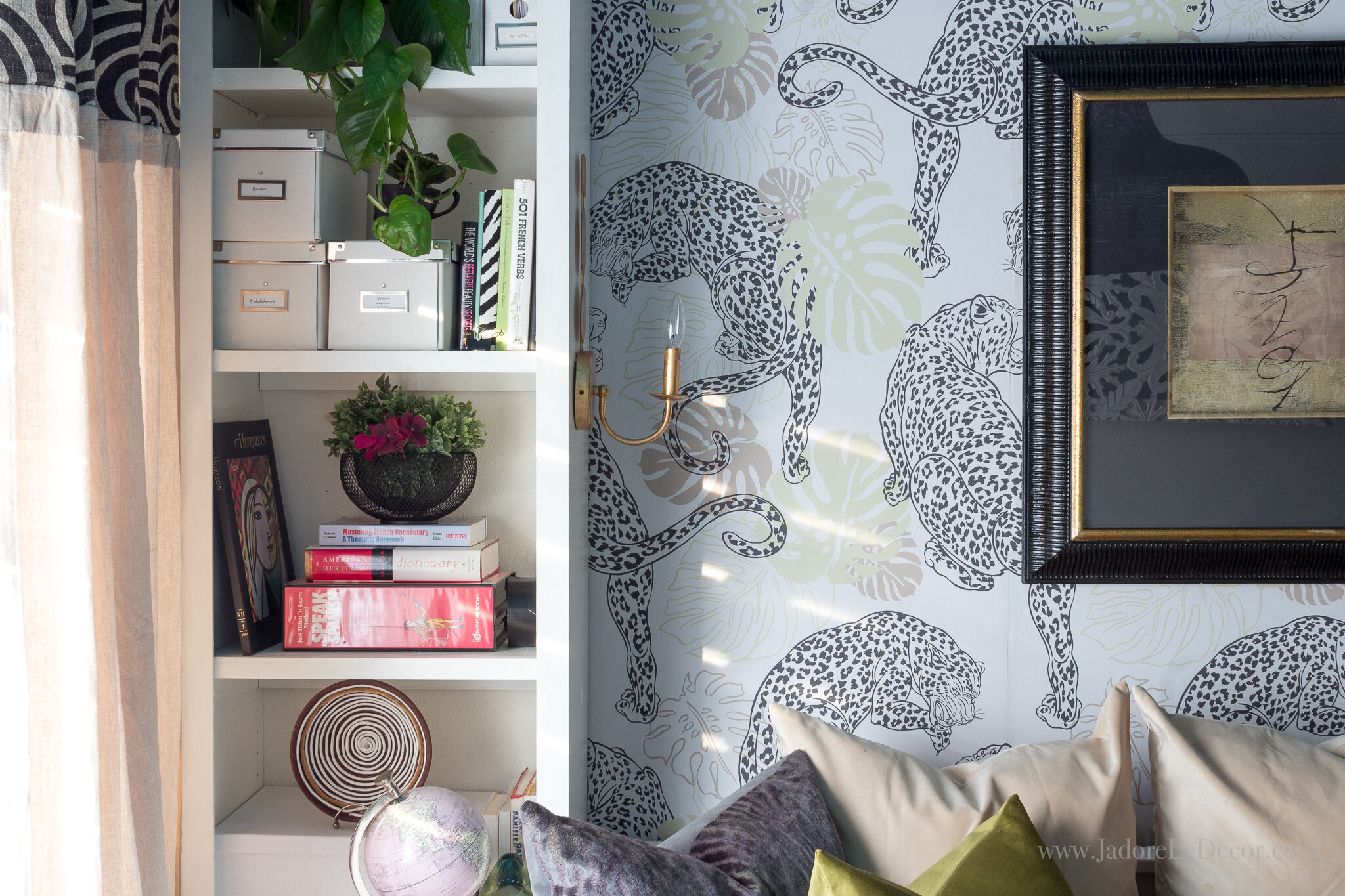
Next, I took a step back to see what colors would look best with this new wallpaper choice. While the new animal print wall paper from the highly respected Milton & King was considerably better in quality and context than my original plan, I wasn’t highlighting it in the best way.
Once I made the slight change in my color scheme to include olive green, the edgy LEOPARD WALLPAPER in crisp creamy tones settled into the space nicely.
3. Add a Statement Piece
Finally, I needed a statement piece to bring it all together. Fortunately for me I found two.
The first was a modern abstract print that neither outshined nor bowed down to the strong leopard print wallpaper ($10 OfferUp). Just as the sun and moon share the same sky with equal greatness, so the dramatic wall art complimented the bold wallpaper perfectly.
The second statement piece was one I already had. Seriously y’all, I could kick myself for not having thought of it sooner. A little over a year ago, I ordered a light fixture that arrived damaged. That worked to my advantage because it was too large for the space where I planned to use it anyway. The online merchant refunded my money right away.
However, instead of allowing me to return the light fixture, they directed me to a junk yard where I could take it to be destroyed. Well, I couldn’t just waste a perfectly operating pendant light because of a dent. So I kept it…. And then I forgot about it. When I did remember it, I assumed it wouldn’t work. As it turns out, that damaged, irregularly shaped light fixture worked perfectly in this is room!
4. Great Design is All About Choices- Not Necessarily Money
If you’ve been keeping up, I only made 3 changes to the space. But what a difference those changes made!
My budget for this makeover was a mere $500. Gone are the days where I used to drop big dollars on items for my home. I’m at that happy place where quality of life trumps an over abundance of expensive material things. With that mindset the first design landed me at $519 and some change.
As awesome as that may sound, one drawback is that an obsession over frugality can create tunnel vision. The second round of changes I made to this space cost a mere $50 dollars more. Was the extra money spent to create the space I wanted worth it? You bet it was!
The crazy part is that had I just given the light fixture located in my in storage a chance, I would have saved $45 on a light that I didn’t really need. Tsk. (insert “duh” head thumping emoji)
UPDATE: The unused light fixture was sold at cost. Additionally, I was able to exchange a couple of the old pillows with new ones. After adjusting the numbers, the grand total spent on this space was BETTER than before! Take a look:
5. Be Flexible
In the real world, nothing goes according to plan. Making over a room is no different. Although I had a plan B, flexibility with my colors was what I really needed. Being stubborn can be a good thing. Being stubborn can be a bad thing. It just depends on how you use it.
6. Look to Your Mentors
Sometimes, you know exactly what to do to fix a problem, but you need someone else to tell you anyway. Why that happens I’ll never know, but it’s quite effective. The three changes above were ones I had silently considered. However, it wasn’t until I reached out to Veronica Solomon, someone whom I consider my design heroine, that I finally pulled the trigger. She was kind, honest and supportive. That was all I needed. WHOOSH, and away I flew!
7. It’s Not the End of the World
If it sounds as if I’m beating myself up in this post, rest assured I am not. Well, at least not anymore, now that I have a room I love. LOL! I do believe though that it’s better to be honest about a mistake than to hide it. Hopefully that came across in this post. The point is that any design “mistakes” can be fixed. Fortunately for me, these errors weren't costly and could be remedied quickly.
To view this makeover in its entirety, here is the full One Room Challenge reveal post.
Will I participate in the One Room Challenge again? Absolutely! Nothing beats the camaraderie and the push to do your absolute best. But next time, I’ll be absolutely sure to keep in mind all the lessons re-learned during the last round.
Now it’s YOUR turn to speak. Please tell me, what do you think about the changes I made to the space? I’d love to get your thoughts in the comments below.


