Taking the One Room Challenge to the "Keeping Room"
Participation in the ORC has helped me to embrace my love of bohemian luxe interiors and to breathe my own kind of soul into it like never before. As I watch my home transform slowly into something that truly reflects the life The Husband and I live, I find myself wanting to create more of that. It just feels good.
Please follow along as we (and some 200 other bloggers) complete a 6-week transformation of our spaces.
Affiliate links may be included in this post. This means that should you purchase a linked product, I may receive a small commission, but at no additional cost to you. To read my full disclosure click here.
Week 1 (the plan) ** YOU ARE HERE // Week 2 (the planter hack) // Week 3 (that wallpaper tho’!) // Week 4 (pink chair covers) // Week 5 (zebra shades) // Week 6 The Reveal
Shopping the Shack for a New Look
The rooms being tackled this time around are the living and dining spaces. Yep, you read that correctly, we will be doing two rooms. It’s just unavoidable since they are adjoined.
To keep costs down my goal will be to shop my home and repurpose as many existing furnishings as possible. To make this happen I’ll be:
Pulling items from other areas of the home that no longer work there
Clearing out my small storage space filled with bargain finds
Selling a few items to make room for the new layout I have in mind.
A Nod to the Keeping Room
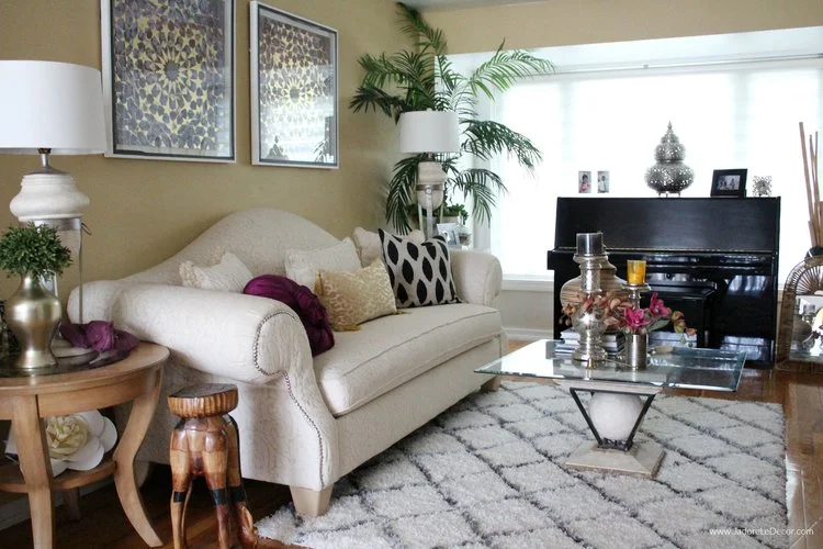
Make no mistake though, this makeover is really all about the living room. I like to call it the “this is us keeping room”. This is not the same though, as our family room, which is located in the finished basement. This room is the second “heart” of our home. Let me explain.
Back in the day (that is to say, in 18th century Colonial America) the keeping room was the warmest place of the home both literally and physically. It was where the wood-burning stove was located, where meals were prepped, and where family members gathered. The keeping room was the closest area to the kitchen that allowed guests to entertain themselves. This allowed the chef to work with fewer disturbances and still look in on the festivities.
Growing up, the formal living room was a place to tell stories of the family. Historical details and photos of loved ones were shared. And through these stories we got to “know” other family members whom we had never met. Music was played, songs were sung and sometimes tears were shed. Walking into a formal keeping room was like throwing oneself into a scene of “This us Us.” Literally. It was warm, comforting, and secure. It helped us to see where came from and where we belonged.
My “keeping room” has remained virtually untouched for the past 15 years and I’d like to change it to create a bit of nostalgia there. While yellow is my favorite color, it is not the most flattering when it comes to home décor, in my opinion. It can read “old and dated” very easily. Additionally, these beautiful creamy white damask camel back sofas (one shown above) are enormous. I love them dearly, but there’s just not enough room for both in the design that I’m going for. So I’ll have to sell one of them.
Obviously I don’t have a wood-burning stove. In fact, I don’t even have a fireplace at all. But I’ve come up with a clever alternative. My piano will take the place of a fireplace. I’m so excited to see how that one will work out!
Addressing the Dining Room
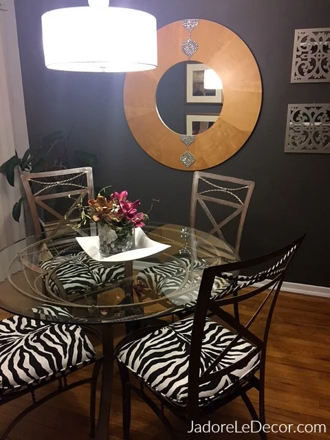
As I was considering this makeover, I could hear the voice of my high-school algebra teacher, Mrs. Lapinski saying “What you do to one side, you must do the the other.” Naturally this means that I will have to do SOMETHING with this dining room.
Truth is though, with the exception of a few minor changes, I love it just the way it is. Nevertheless, I plan to change out the light fixture, replace the 80’s blinds and the two dinky pieces of artwork that flank the mirror. I’ll also attempt to find some snazzy covers for the dining chairs.
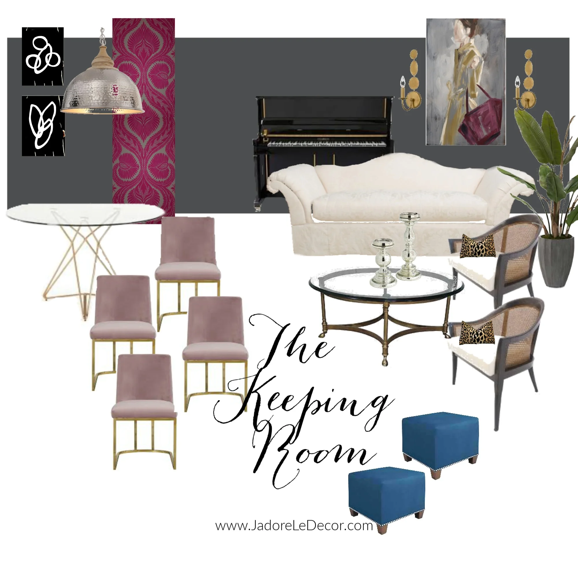
Below is a VERY loose concept of what I hope to create between the two spaces:
It would be virtually impossible for me to illustrate all of my ideas on a simple mood board- especially when I’m still hashing out the design in my head. But here are a few more details:
The eye-catching pink damask that you see above is actually wallpaper that will be applied to a column that separates these two rooms.
The black and white artwork is just a fill-in for art that is currently being commissioned for the space.
And there is a whole other side (not shown) which will include a gallery wall and a chest of drawers.
This is just a summary of how the finished room should look. What do you think?
One Room Challenge Schedule:
Week 1 (you are here) // Week 2 // Week 3 // Week 4 // Week 5 // Week 6 The Reveal


