5 Epic Upgrades for the Best Bedroom Refresh Ever
Calling this project a bedroom refresh sounds like a gross understatement when I consider the amount of work that went into creating it. The changes were simple, yet monumental. A little reworking of a diy light fixture, a vintage dresser flip, and the addition of architectural features among other things, helped catapult this bedroom into a whole new level of design that has rendered me dazed and amazed. Here’s the breakdown on how it all came together.
Affiliate links may be included in this post. This means that should you purchase a linked product, I may receive a small commission, but at no additional cost to you. To read my full disclosure click here.
What We Started With
First let’s take a step back. The playfully hypnotic and coy décor from the previous bedroom makeover is no more. All the pink fluff is gone too– well most of it anyway. The subtle pink glow from the SW6274 -Destiny paint color by Sherwin Williams remains. However, all the dizzying patterns and overly feminine expressions have been nixed.
After all the fanciful decor was stripped back, it was time for a few thoughtfully selected elements. Little by a little, a sultry-cosmopolitan-vintage-chic vibe emerged that blends both our styles effortlessly.
5 Key Upgrades that Transformed this Bedroom
Since my participation in the Fall 2019 One Room Challenge, I’ve noticed a marked change in the way I approached planning new spaces. I’m forcing myself to narrow down my choices to include only the ones that really matter to the overall design. In short, I’m practicing the art of editing my space. Trust me, it’s not as easy as it sounds. Instead of focusing on lots of little tchotchkes, I made a conscientious effort to limit my attention to five main areas.
1. The Addition of Architectural Features
When creating memorable spaces, the paradoxical statement “less is more” couldn’t be more accurate. The funny thing about architectural details is that once you add them, you need fewer… things. Less artwork, less wallpaper, less everything. Not surprisingly, it was an architect, Ludwig Mies Van Der Rohe who popularized the phrase. He was right.
“The funny thing about architectural details is that once you add them, you need fewer… things. Less artwork, less wallpaper, less everything.”
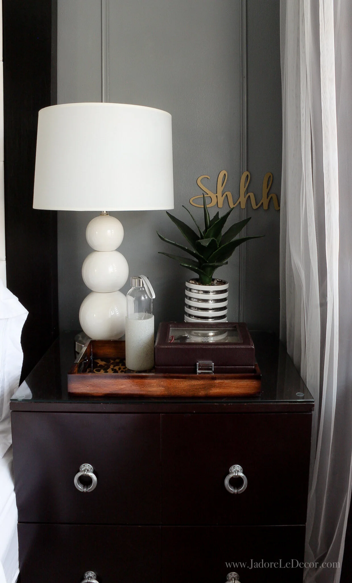
If I had to choose between buying $150 in random décor crap or adding character with mouldings and trim, hands-down the latter would win every time. The simple wall and crown mouldings, along with a ceiling medallion elevated the overall feel of the space immediately. They also determined the course for all the other decisions that followed.
The vintage mirror below (thrifted) and another small piece of art the only wall hangings.
2. Small Lighting Upgrades
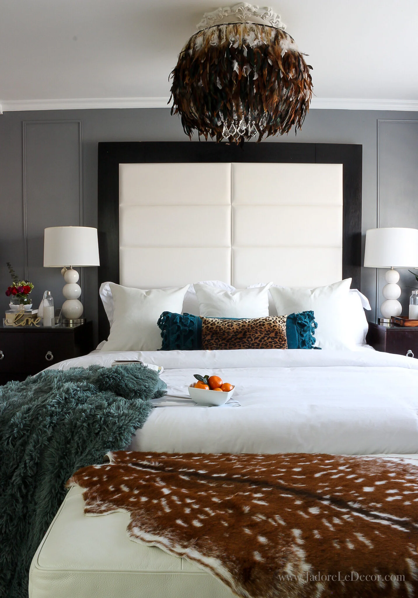
Not all upgrades require ditching what one has in exchange for something new. And that’s how it went with the feather light fixture over the bed. It was a partial DIY that I completed a couple of years ago. Although the husband said he was content with it, I was looking for a way to make it less feminine.
One day, someone messaged me on Instagram and suggested that I darken the feathers. I saw the vision immediately. Further proof that there is absolutely no reason for stylists and designers to be snobblish. Epic ideas can and often do come from people and places apart from us.
Although I wasn’t able to find exactly what I had in mind, what was available at my local textile shop works perfectly. The new look also compliments the beautiful high-end deer sconce sponsored by Craftmade. It’s from the Churchill line. Isn’t it gorgeous?!
3. Create a Feature Wall
Feature walls of course are not a new idea. In this case, however, my pseudo-feature wall turns out to be my headboard due to its enormous size. Thanks to a bit of positive pressure from my sister-in-law, I decided to change it by adding upholstered wall panels.
4. Keep the Look Fresh with Artwork
The humungous boxy headboard and traditional nightstands were all purchased for a $167 song from the W Hotel. The Indonesian mahogany cabinet is from Nadeau, and the vintage chair was thrifted. With all the traditional, vintage and global furnishings, this space was desperately screaming for a dose of modern swagger. Adding art was an easy fix.
Regular readers of my blog already know that Great Big Canvas is my go to for affordable art. The ability to order art as repositionable wall peels is so ground-breaking to me, I have no clue why more art dealers don’t offer it. Two of the 4 prints in this space are actually wall peels. Simply pull the protective backing off and place it anywhere you like.
5. Include a Showstopper
I like to have a little bit of eye-candy scattered throughout when I’m styling a space. The tricky part is executing it with a controlled hand. But I think I’m getting better at it.
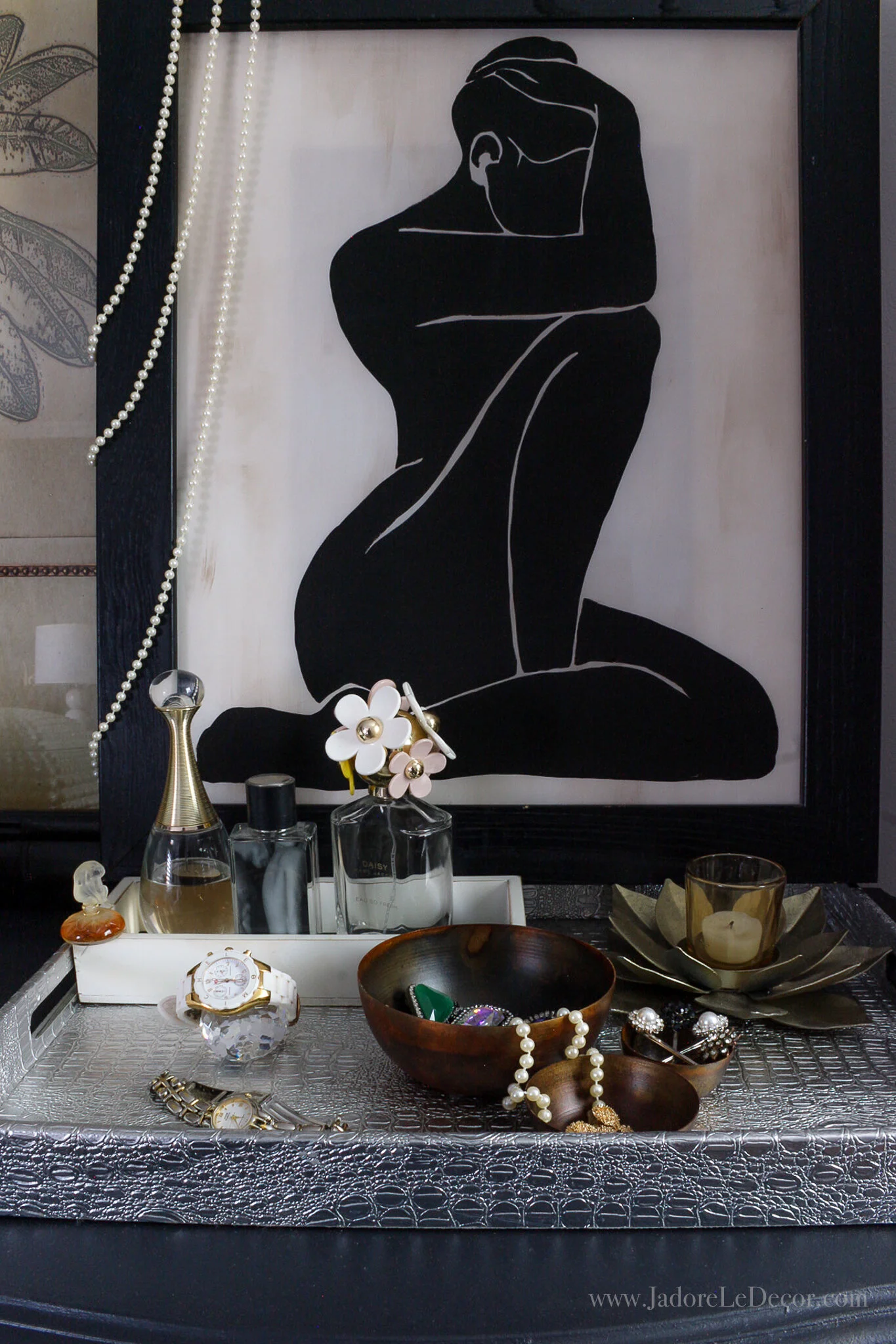
Le pièce de résistance in this makeover is hands-down the bombshell Drexel Heritage vintage dresser. Here’s how it looked before I flipped it using Velvet Finishes Luxurious black paint. I loooooveee this piece.
Who would have thought that a simple early morning conversation about paint color between The Husband and I would have lead to all of this??? I certainly didn’t. But I have no regrets and I expect this room to remain this way for a very long time.
If you’ve been with me since the beginning, I sincerely thank you for taking this journey with me. I’d love to know what you think of the changes. Let me know if the comments below.
Please remember also to show the other ladies some love as well.


