How to Master the Art of a Carefully Curated Room
There are some rooms that seem perfectly decorated. They are the ones that appear as if all of the objects inside were drawn into the original construction plans. If you've ever stepped into a space like this then you've experienced a curated room.
It is tight and steady; effortless and intentional all at the same time. Like a set of great abs, it is beautifully sculpted.
Did you lock in that visual? Good. Now let's find out how to duplicate it.
Affiliate links may be included in this post. This means that should you purchase a linked product, I may receive a small commission, but at no additional cost to you. To read my full disclosure click here.
Realistically speaking most of our homes - and bodies for that matter - don't and won't ever look perfect. But there are a few principles that can prevent our homes from looking tired, over stuffed or cluttered.
What It Means to Curate a Space and How to Do It
In its simplest form the word curate can mean hand-picked or individually selected for a group or collection. The aim is to select only the best, most relevant and useful items for a space.
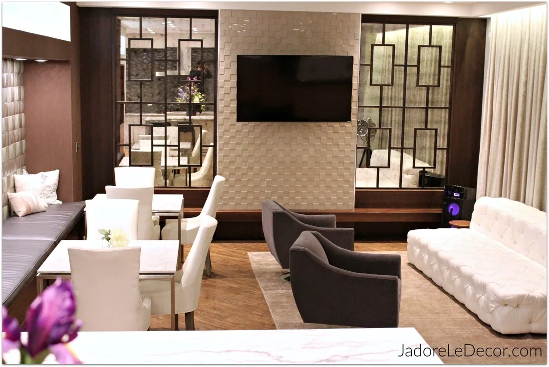
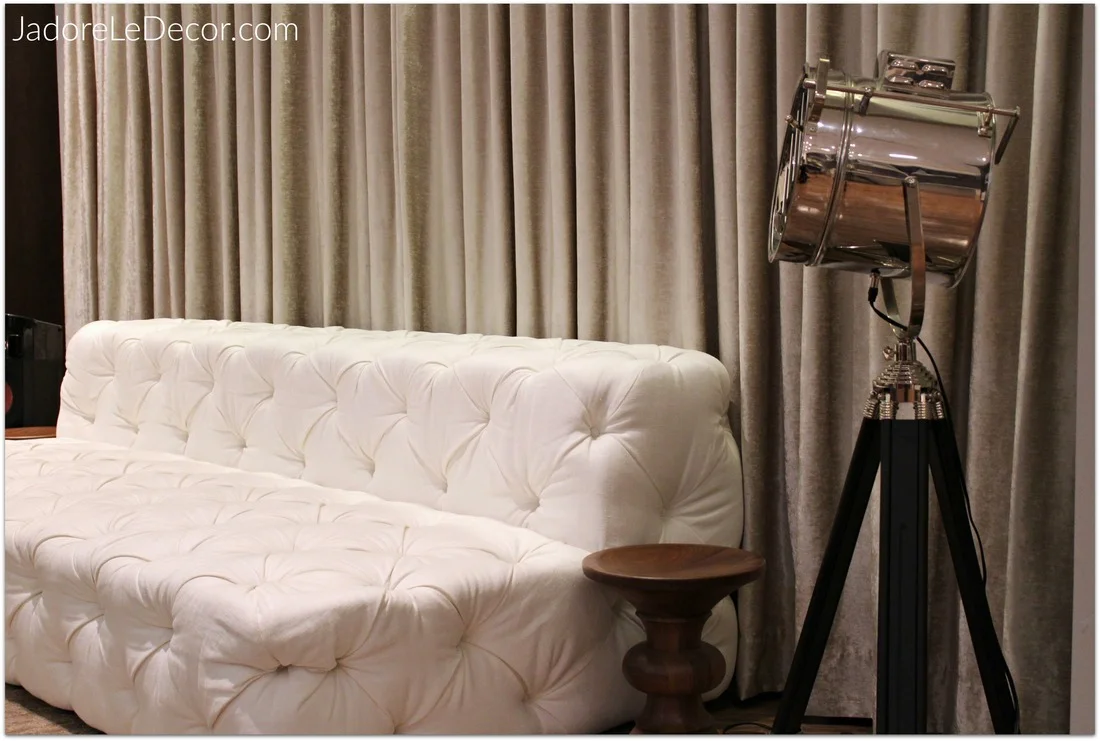
To illustrate this point, I searched for and found a social room in a luxury apartment complex called Somerset Place. The space measures roughly 270 square feet and perfectly illustrates the principles of a carefully selected room. As you view the photos below, try to imagine this space in your own home.
Designating the Areas
The Launch Pad
I love how the designers took care to include an area that would typically serve as a lunch pad. Notice that the space is not overwhelmed with day to day stuff. There are drawers and cabinets for shoes, hats, keys, purses, wallets, glasses and just about anything else you might need to to grab on the way out the door. Coat hooks or an umbrella stand might be the only additions.
Practice the Controlled Use of Accessories
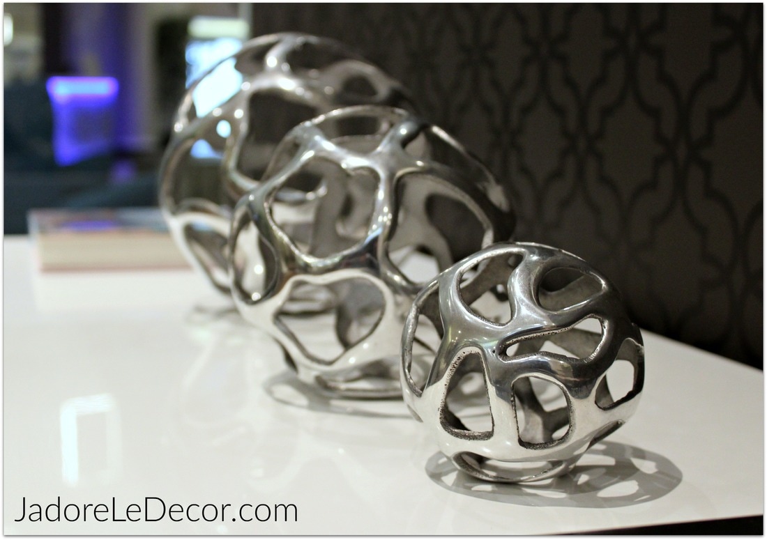
Many of you have told me in previous comments that you would like to embrace minimalism. Count me in too! But minimalism requires discipline. There are only 4 accessories used in this entry way: a mirror, a set of spheres, and two books. Now take a look at your home and determine what items can be removed. Keep only what you love, need and use.
Add Complimentary Textures and Finishes
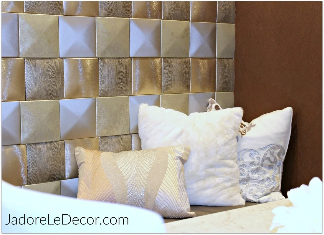
I love how they continued the mocha and white color palette in the kitchen. A mixture of wallpaper, glass tile and marble were used in this room. Also, the metal from the slender buffet table in the center of the room, harmonizes with the stainless appliances in the kitchen. Can't afford high-end wallpaper or tile? Invest in a beautifully cut stencil. The results will amaze you!
Of course the real beauty of well selected room is the quality of the materials. Every item in this room was top-notch. The beauty of living in a small space is that higher end finishes will cost a lot less since there is not as much area to cover. Take a look around your home. Are there any small finishes like door knobs, counter tops, or light fixtures that could be upgraded to give a space in your home a more polished look?
Create a Consistent Color Scheme and Add a POP!
A good rule of thumb when decorating is to use a minimum of three colors. At least one of the three colors will usually serve as an accent color. So where is the third color in this room? Take a look below.
BAM! There she is - bold, beautiful and red with built-in open display shelves and storage underneath. Normally an accent color is distributed three or more times within a room to give it depth and cohesiveness. But this wall of shelves and storage is just enough color for the space. What are the main colors in your home? What is your "POP" color?
Use Multi-Purpose Furniture When It Makes Sense to Do So
Just as the sideboard served as an entryway table, so the bar height table (floating in the center of the room) can serve as an office desk, or a place to do homework.
Additionally, the built-in display case can be used as a library, an open pantry, or even a closet. Interestingly, all of the furniture on this side of the room was either multi-purpose, or had space available for storage. So all of the clutter stays hidden. Love that!
Even still, it makes sense to analyze your space to see if it makes sense to purchase a multi-purpose piece of furniture. Some multi-purpose pieces call for a sacrifice in some other area, be it size or comfort. For that reason, I don't recommend choosing a piece of furniture soley because of its dual purpose.
Pay attention to Scale and Proportion
Scale refers to the size of an object in relationship to the room and other objects in the room. If you've ever seen an enormous sectional crammed into a room that's way too small, that means the scale is off. Proportion is the shape of an item in relation to other items. Notice that the furniture is neither too tall, or too short for the room. Also, the lines on the back of the chairs - even the kitchen bar stools - compliment one another.
There was one last thing that really surprised me about this space. Did you notice that there is not even one piece of artwork on the walls? And yet the space looks complete. I bet you didn't even miss it, did you? All the clever use of tile, wood, mirrors, and fabric on the walls eliminated the need for artwork. Genius!
Tell me:
- Do you think these principles can be applied in your home?
- What is your favorite thing about the space featured here


