Appreciating the Strength of the "Collected" Space
Man Spaces Week Featuring: RJones Designs
It's Day 4 of my first ever Man Spaces Week.
All week long I've been getting the same questions: Why have a Man Spaces Week? And what is so-called "masculine decor" anyway?
I've always loved the anchored look of masculine inspired rooms. Decor related topics are so often geared towards women. So why not change it up a bit? As for the second question, I'll break it down for you with a simple analogy.
Masculine interiors to me, are like a man's suit that has been precisely tailored; bold across the shoulders, gentle lines toward the waist creating an ideal inverted triangle, coupled by very subtle movement from often dense, shadowy fabric. Streamlined. Collected perfection. Today's guest, Ron Jones, translates this description into interior design masterfully.
Affiliate links may be included in this post. This means that should you purchase a linked product, I may receive a small commission, but at no additional cost to you. To read my full disclosure click here. All photos featured not marked "J'adore le Décor" have been used with owner's permission.
Ronald Jones, founder and owner of RJones Designs has been formally trained in Construction Management, and holds a double minor in architectural and business administration. He is a technical genius and a man of few words, so I will do my best to articulate his style.
Company Name: RJones Designs
Style: "Tuxedo"-like transitional design with rich layering of textures,
Where to Find Him:
“A room should feel collected, not decorated”
Creating a "Collected" Space
What exactly does the quote above mean? The exact definition of "collected" in terms of design/decor may vary from one designer or stylist to another. But in the simplest terms it means:
Curate (carefully select)
Balance
Edit
Of course these principles apply to feminine inspired interiors too. But the execution, the way it is carried out, is a bit different for masculine rich rooms. Continuing on with my analogy of a man's suit, notice the tailored details in Ron's personal dining room below, as well as in the sitting room he designed for a client .
What words come to your mind as you view the photos above? These rooms are strikingly handsome, as opposed to "pretty". Although a variety of textiles have been incorporated, the finished look is chiseled, structured, and heavy instead of delicate or curvy.
Notice also the very limited use of "bling". It's used only where it is needed, in the gorgeous lighting, or a mirrored furniture piece. Although this style could equally be fitting for a woman, these rooms look more like earthy cologne than flowery perfume to me. Don't you agree?
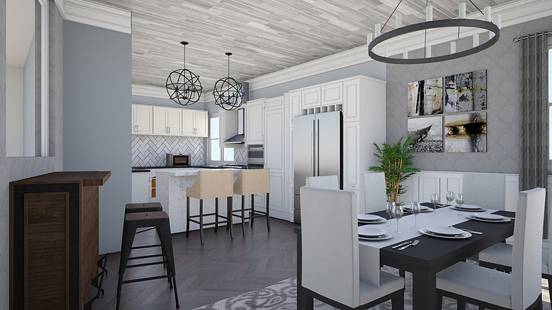
The look can even be achieved with softer color palettes. Notice the symmetry and inclusion of rich, heavy woods in the table, bar and parquet floor in one of Ron's digital renderings below.
Finally, a man in an exquisite suit never looks as though he purchased the entire outfit at one time. Because in many cases, he didn't. Rather, every item of clothing has its own "story". The main garment may have been purchased in Italy, while the tie was scored on a recent trip to London. The cuff-links were purchased from Macy's, and the shirt from Charles Tyrwhitt. So likewise, the "collected" room looks as if its been assembled over time.
Mingling the principles of picky selection, balance and editing always produces a strong, cohesive result. When you add a masculine flair, the overall look of the room is just down right fine. That pretty much sums up what I appreciate about collected masculine spaces.
Please tell me in the comments below, is your style more feminine or masculine?
One more favor may I ask of you?
If you enjoyed this post
Please share, tweet or pin it.
Merci Beaucoup!


